
Brand and website design and re-platforming
Politics aside, Sean Spicer’s first press conference as White House Press Secretary was, shall we say, different. So different that it compelled us to visit the White House Correspondents’ Association (WHCA) website to learn if they had published a statement in response to it. To our surprise, we encountered a website that had not benefited from a redesign since 2008, and therefore lacked most of what we expect these days from a modern experience—responsive design, dynamic content, the basic tenets of accessibility. The site consisted of static HTML files, several broken slideshows, microscopic text, and design and content inconsistencies. It was immediately clear to us (as it had been to the association) that the WHCA needed a modern design and publishing platform for what lied ahead.
- Services
-
Design, Development, and UX
- Industry
-
Social Impact
Additionally, we felt that an organization with as high a profile as the WHCA lacked an identifiable visual brand that was emblematic of the important work they do, which is to promote excellence in journalism and to ensure robust news coverage of the president and the presidency.
It turned out our timing was fortuitous, and in July of 2017, the WHCA board approved the decision to work with Happy Cog on the project, based in part on our deep experience with other organizations like the Institute for New Economic Thinking, The Annie E. Casey Foundation, and the United States Holocaust Memorial Museum.
The objectives
Our primary objectives for the work were to:
- Convey the importance and mission of the organization
- Create a compelling and identifiable visual brand
- Create a bold, yet easy-to-use site experience
- Make content updates simple by implementing a modern content management system
- Highlight the centerpiece of the WHCA: the annual dinner
- Provide means to accommodate future archival content
Prior to our work, it was important for us to come as close to the perspective of a White House Correspondent as possible. Happy Cog Principal Greg Hoy and Design Director Michael Johnson were invited to the White House for a tour of the Press Room in the West Wing and the North Lawn (with the unofficial moniker “Pebble Beach”) where correspondents often do their live reports.
A distinctive visual brand
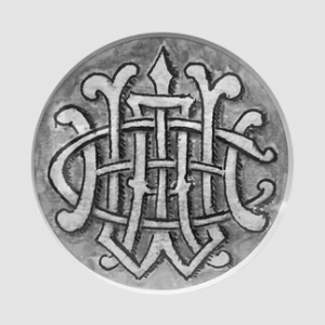
 Apart from a (really cool) artifact we were made aware of from 1914 which portrays a symbol representing the organization, the WHCA (in the digital era) hasn’t had a distinct visual brand to call their own.
One of our first recommendations was to design a visual identity for the WHCA. We always provide multiple concepts from unique perspectives.
In the end, the chosen mark combines two visual ideas: a flag on a pole (symbolizing a free press as being the strongest pillar of democracy), and the The James S. Brady Press Briefing Room’s recognizable seating layout. When animated, the letters fill the space, akin to the correspondents before briefings begin.
A bold new look
Our redesign underscores the association’s rich history of independence and excellence, with a strong nod to the future. Perhaps the most well-recognized aspect of what the WHCA does is the annual White House Correspondents’ Dinner. A primary objective of the redesign was to ensure photos and videos from the dinner easy to access, and presented in all of their full-res glory.
Another primary goal of the WHCA is to support scholarships aimed at encouraging a new generation of reporters, so highlighting scholarship winners and participating higher educational institutions was paramount.
Meet the (dot) press
The legacy domain for WHCA’s website was whca.net, something that seemed at odds with the association’s purpose. While .net (one of the original top-level domains) was originally intended to be used for organizations involved in networking technologies, it had become a general purpose namespace that was frequently adopted by the advertising industry. It seemed like an odd choice for the WHCA, over something like, say, .org. With the semi-recent unveiling of a multitude of new top-level domain (TLD) extensions, we thought that .press was perfectly suited for the WHCA’s purpose. The WHCA agreed. Therefore, our redesign can now be found at whca.press.
The infrastructure to handle it all
Since the previous WHCA website was simply static HTML, Happy Cog needed to implement a modern content management system in order to facilitate content publishing. There was already familiarity with WordPress within the WHCA, so we implemented the platform with several customizations to serve the WHCA’s specific needs. We also wanted to deploy the site on a fully managed WordPress-centric platform, and we looked no further than our old friends at Media Temple.
The 2018 White House Correspondents’ Dinner, featuring comedian Michelle Wolf, created quite a bit of controversy. Fortunately, Media Temple’s hosting didn’t flinch during the traffic spikes during the event, or the tumultuous days that followed.


