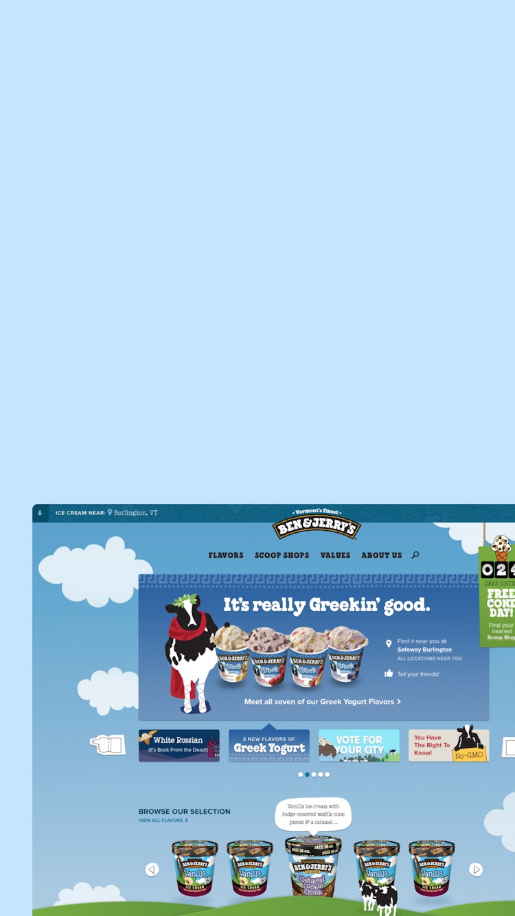

Website design
Happy Cog partnered with Ben & Jerry’s for a full-scale redesign of their global web presence.
The site not only needed to meet the needs of fanatical U.S. consumers, but also had to adapt to new markets where Ben & Jerry’s remains unfamiliar. To account for varied audiences, we recognized that we had to take a modular approach to design, development, and content. By focusing on custom product, social, and campaign messaging aligning with each market’s needs, we delivered modules that could be tweaked and reused case-by-case.
The site also had to encourage visitors to connect the dots between ice cream and Ben & Jerry’s core values and the global initiatives it champions. We intertwined these findings at meaningful points throughout the experience. Happy Cog also assisted in content creation for the site by partnering with our friends at Crush + Lovely to produce video content. We also wrote plenty of copy.
We made iterative design and front-end updates as templates were being built. This process allowed us to see how changes worked across layouts, screen sizes, and browsers—especially with complex pieces like the navigation. We created detailed write-ups of our work in a style guide and content guidebook. These guidelines helped Ben & Jerry’s stick to the system, while still keeping the whimsy for which the brand is famous.
- Services
-
Strategy, Brand, Analytics, Design, Development, Headless CMS, Marketing, Paid Media, and UX
- Industry
-
Food


